Ads promoting horse and rider teams are as much a part of the horse show culture today as the show clothes you wear and the saddle you ride in. To take your competitiveness to the highest levels, exhibitors know it takes more than just a great horse to stand out against your competition.
So, you’ve decided to run some ads because you want to get noticed… but how? We spoke with a few of the top ad designers in the horse industry to get their take on what makes an ad turn heads.
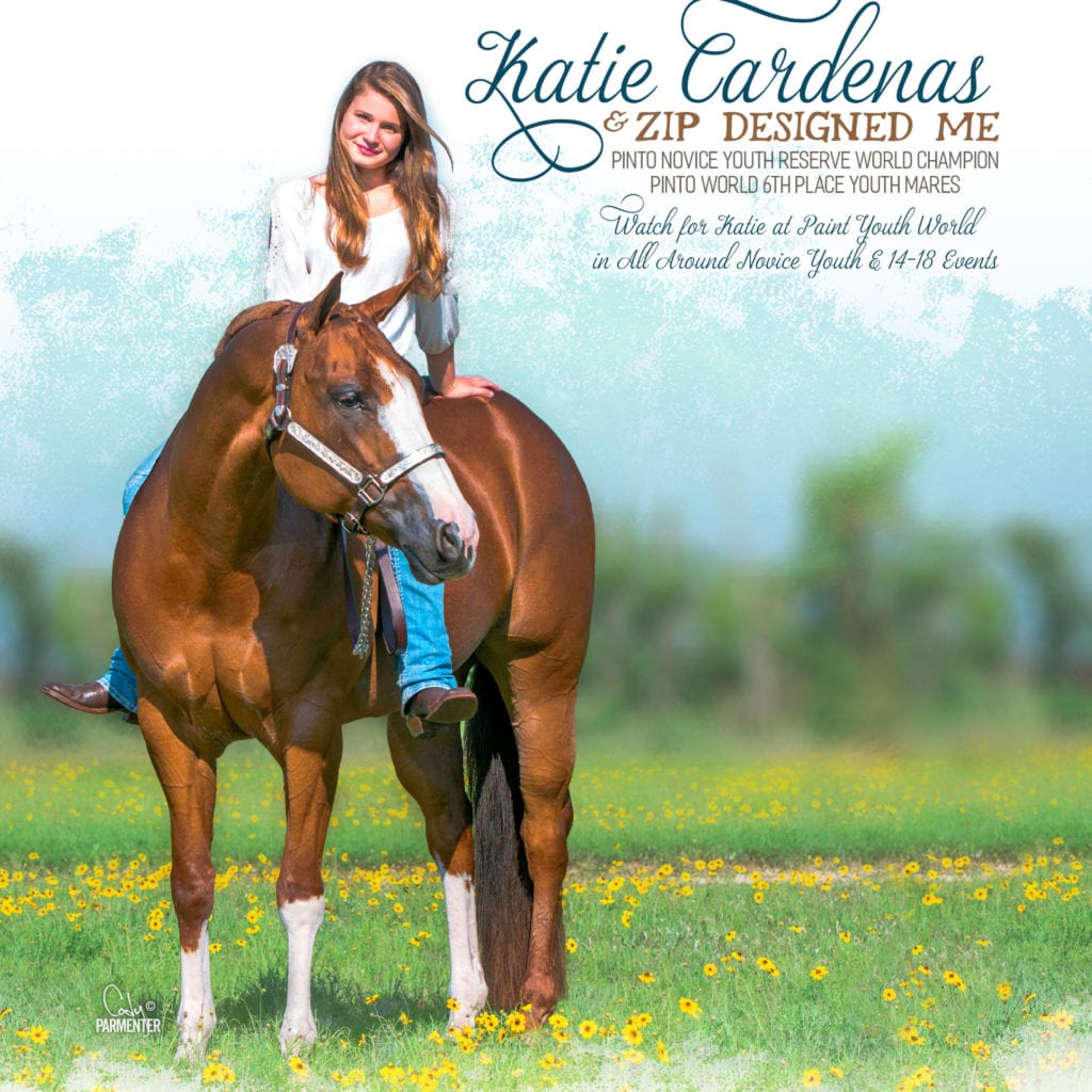
Many designers insist that the ‘wow factor’ is what you want. Cody Parmenter of Wavelength Design believes that it all starts with a strong feature image. And the goal here is to command the whole page.
Victoria DeLaRosa of Valor Designs says, whether they’re professionally done or you’re taking them yourself, you should “take as many [photos] as it takes to get that WOW image.” She adds, “beautiful, high-quality photos are the backbone of any great ad.” Exceptional ads tend to be more unconventional and often include candid photos.
So, you’ve got those stellar pictures. Now you need to use them. It’s best to give them room to run.
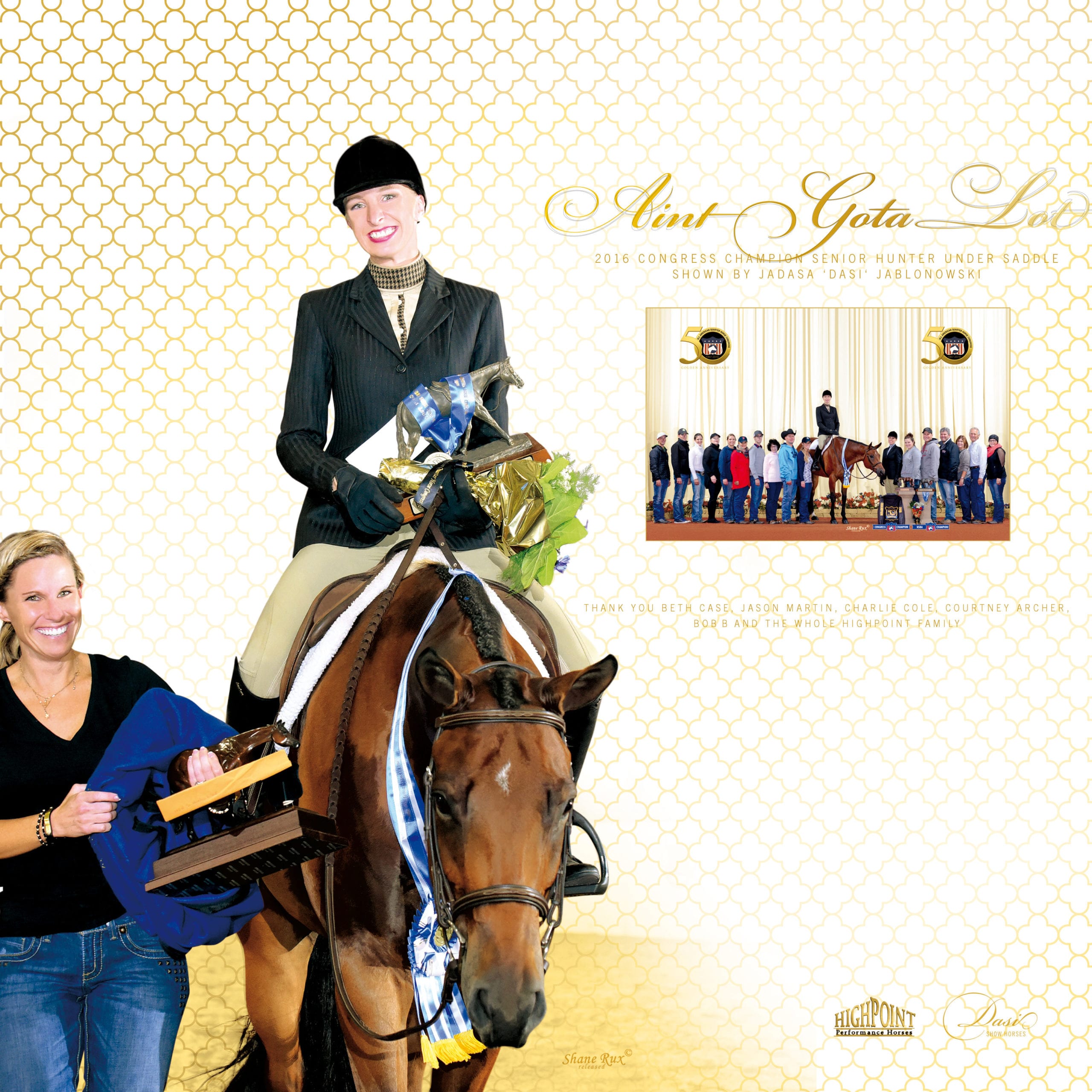
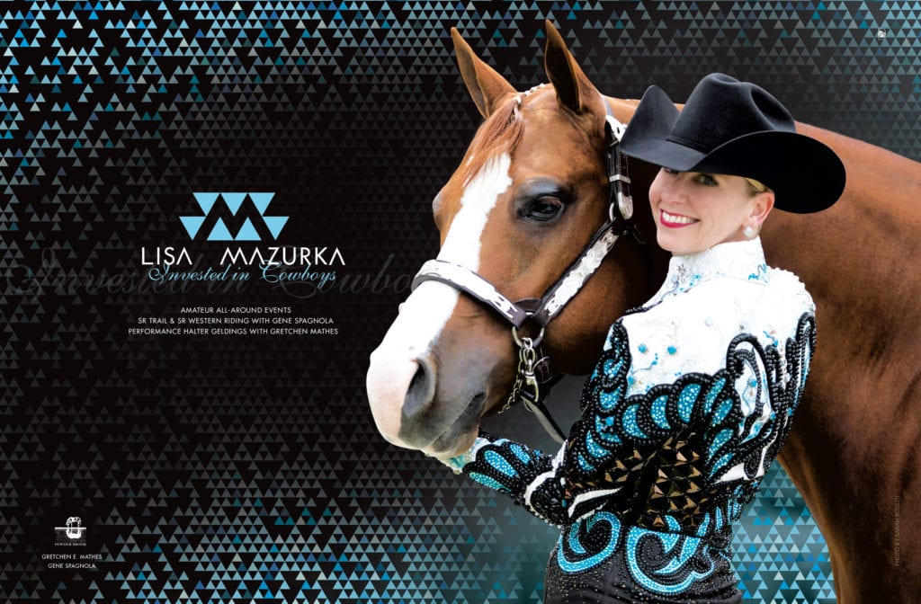
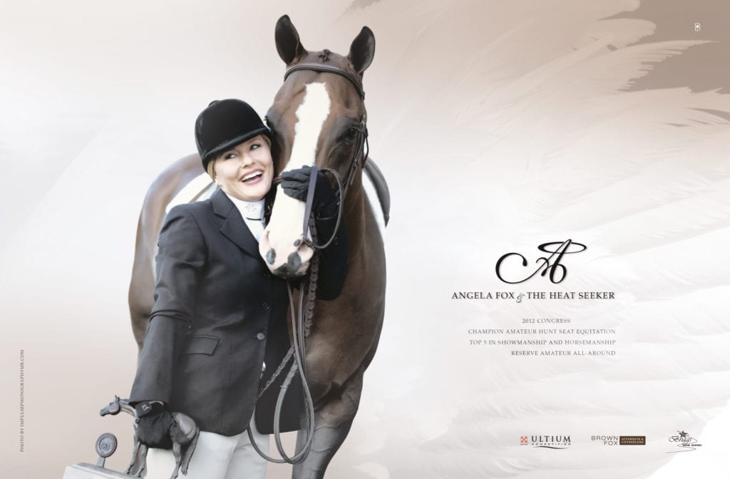
That’s what everyone loves about two-page ads (pictured below). They give you so much more room to ramp up that ‘wow factor.’ When your ad takes up both pages, you’ve also eliminated the competition. Jadasa Jablonoski, better known as “Dasi” of Dasi Equine Advertising and Parmenter both agree; it’s definitely a good thing when there are no other ads taking any attention away from you and your horse.
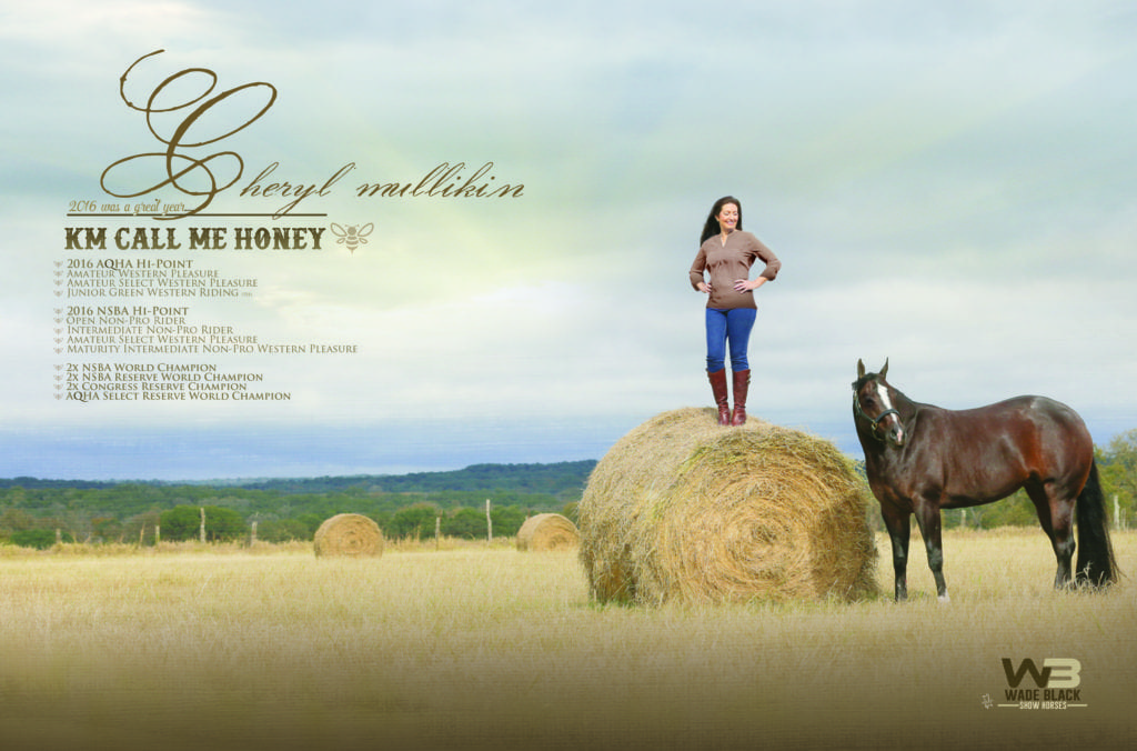
When designing ads for digital publications like GoMag, designers no longer have to worry about saving space for the gutter; that wasted space between pages in print publications. Having an unsightly seam running down the middle of a beautiful ad is like having a post in the middle of a living room. With digital publications, designers no longer have to design around it and can now use that space for you. Those championships you’ve racked up are the extra details that might not make it in otherwise.
When it comes to colors and themes, designers look to their customers. Those decisions might be inspired by your barn colors or perhaps your show clothes. Some might even be a play on your horse’s name. Adding these finer details can set your team apart before you even jog in.
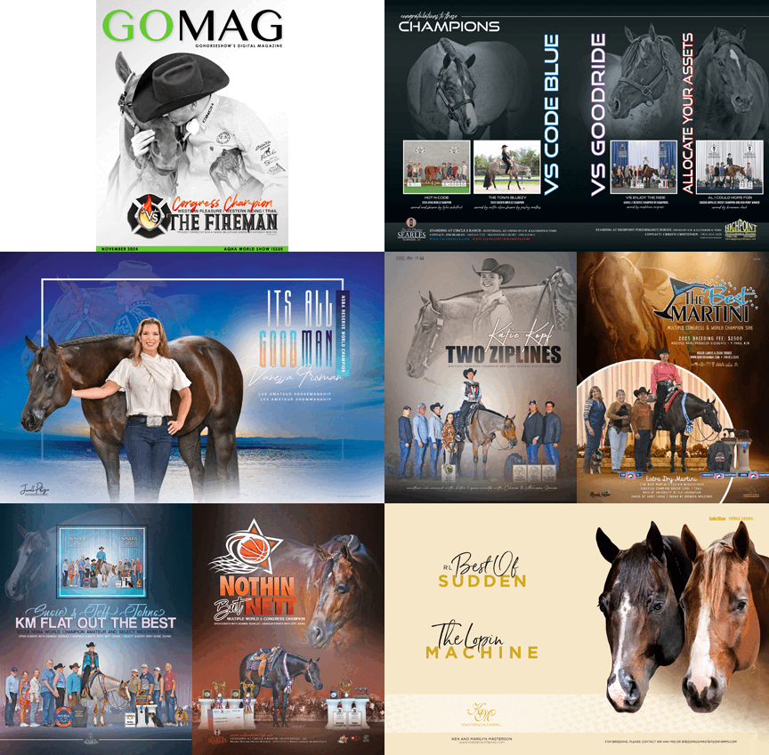
Having a unique personal logo establishes your brand. It can be used again and again through not only your current ad campaign but your entire show career. Dasi designed this one to play off of the exhibitor’s last name. It happens to compliment her show clothes as well (pictured below). Judges will recognize her unique symbol year after year.
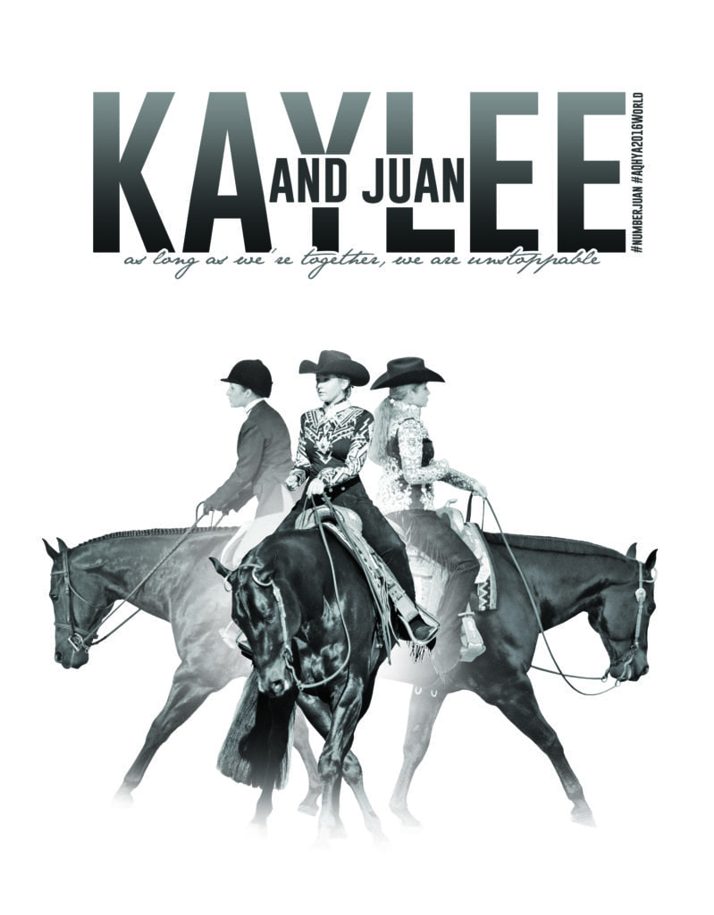
If you’re considering adding a social media element, sometimes less is more. Just look at how Eric Mendrysa of Emajes Design and Photography snuck #NUMBERJUAN into this ad (pictured below). Admit it, you’re tempted to type that hashtag into Instagram and see what comes up. Those clever little kicks grab the attention you want, both in and out of the show pen.
Now that you have your brand, is this a one-time boost for an upcoming futurity or is this part of your show season program? Mendrysa suggests a year-long campaign. It gives your team the chance to develop a rich theme for your ads.
Dasi agrees. She prefers to start your campaign by showing off your show clothes and tack, focusing on a couple recognizable elements that will stay consistent throughout the year. Once you’re further into the campaign and have some accomplishments to promote, she feels you can then incorporate those more intimate shots. A great example is pictures where you’ve just been given an award and the happiness is written all over your face. Check out this ad below. It isn’t posed, but the expression of both horse and rider speak for themselves. These long-term campaigns are a great way to build your momentum through the show season.
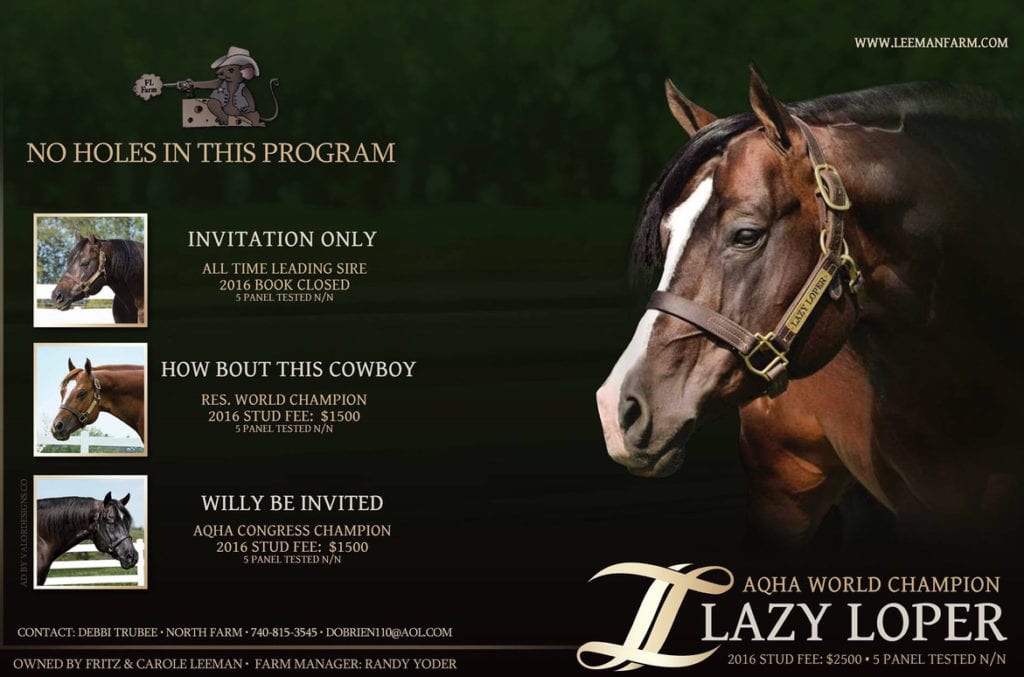
When it comes to stallion ads, it’s best to let the boys speak for themselves. Mare owners want to see great pictures of a stallion’s head, conformation, and color. DeLaRosa says the key here is to let the natural beauty and correctness of a stallion shine through.
Regardless of the type of ad, great pictures and a great game plan make all the difference. Well-defined ads will turn heads and build anticipation. Your ad will tell people why they should watch you, whether it’s for a single show or a whole season. Each new ad will remind them how well you’ve performed. Let GoMag help bring out the best in you.
All ads courtesy of Cody Parmenter, Dasi, Victoria DeLaRosa, & Eric Mendrysa.


