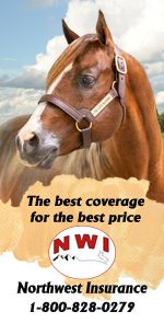
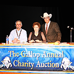
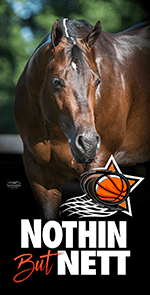
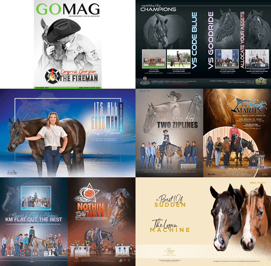
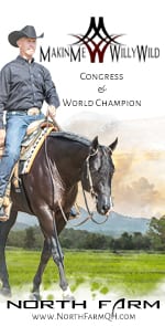
This is the first in an on-going series of articles about marketing and advertising brought to you by Kathleen Downs, principal of Market Street Marketing based in California.
Kathleen’s credentials include a Master’s degree in Advertising Design from Syracuse University, as well as a knowledge of horses gained from showing on the AQHA circuit. Through this series of articles, she will discuss tips on how to achieve the results you want, stay in a budget, develop a media plan, communicate effectively with your designer and photographer, explore new trends and more.
Advertising 101; Making an Impression
Some of the most important elements to consider in equine advertising are the very same principles that apply to corporate ad work. People are busy and often glance at most ads instead of actually reading them. In fact, the average viewing time for most advertising is about six seconds which is not very long. There are many things that go into getting an ad noticed and making a good first impression.
One Idea Per Ad
One way to achieve this is to limit your ad to a single, clear idea. Sometimes clients are tempted to try to impart too many messages for a single advertisement, thereby making each of them less potent. In many ways, the more simple the message, the more powerful it is.
Superior Photography
Using superb photography is critical for getting noticed in advertising. If you are going to invest the resources to plan, design and insert advertising into the various equine magazines, or on the web, it makes great sense to have unique, clear and meaningful photography for your message. A great photo stops the audience. That is the critical first step in getting your message noticed.
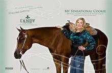 The Landy Paint Ventures advertising is a good example of this concept. Meredith Landy utilized a highly respected fashion photographer to shoot each of her three show horses on location, thereby obtaining a year’s worth of gorgeous photos for her advertising. Meredith reduced her time and overall cost all while getting an outstanding product to better communicate her message and help her stand out.
Hierarchy – That Thing That Shouts
Just as the one idea per ad is important, equally important is the hierarchy in each piece of advertising. If all elements that appear in the ad are of the same weight and importance, the ad simply loses its punch. Make that most important idea shouts and leave space for all the other elements in the message to whisper. Once again, proper hierarchy stops the audience, gets you noticed and leaves a greater impression.
Colors – Developing a Color Scheme
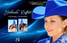 Colors make us notice. Some of the most powerful color combinations come from nature. This is especially true in good web design. Whether developing a single ad message or a year long campaign, consistency in color, font and style help you get noticed and remembered. When we use colors that tie into or are in the same family with horses or outfits, the message pops! A good example of this can be seen in the Gabrielle Lofton idea. Miss Lofton had a very unique color of outfit and we took advantage of this color to get her ad message greater impact and notice.
The All Important Point of Difference
So what makes you special? What makes your horse, your relationship with your horse, your barn, your training, your farm, your stud, different and unique? This is what we like to refer to as the relevant point of difference. It is one of the first and most important things we discuss before developing ad campaigns, large or small.
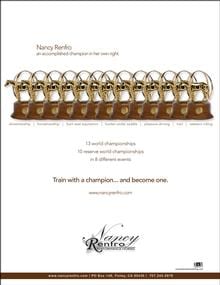 A very good example of this would be the ad campaign developed for Nancy Renfro Performance Horses. Nancy has achieved 13 world championships in many different events which is truly impressive and very relevant point of difference for her clients. We expressed this point of difference through images of her world show trophies as seen in the example here.
These are just a few of many important details and concepts that go into making advertising work harder, obtaining better results and getting you noticed. Working with a good advertising designer is an important part of that process.
Kathleen has owned Market Street Marketing for 20 years and specializes in both corporate and equine advertising. Kathleen does all kinds of print work, logo identities, brochures, direct mail, email marketing, annual reports, newspaper and magazine advertising campaigns, as well as designs and web hosting. Kathleen holds a Master’s Degree in Advertising Design from Syracuse University in New York. She shows several AQHA events including Hunter Under Saddle, Hunt Seat Equitation and Horsemanship.
You can see much more of her work at her newly designed website marketstreetmarketing.com


