
“Will this color look good with my horse?” You’ve probably pondered this question more than once when shopping for show clothes, whether you’re browsing online or working closely with a designer.
When choosing the color to pair with your horse or simply picking the best for your body type, opinions abound, but GoHorseShow went straight to the experts with experience under their belts: Wendy Brown of Show Me Again, a force in the show clothing business for over 15 years; Tammy Dyer of D Designs, who specializes in one-of-a-kind, detailed custom pieces; Darlene Lowe of DarDar8 Designs, an innovator of custom show clothing since 1999; Babe Woods of Woods’ Western, a trusted authority of dependable creativity in the show industry; and Lindsay Klempel of Silver Lining Apparel, known for cutting edge designs and quality.
Staying Neutral

 Selecting a color that complements your horse doesn’t have to be complicated. But if you love getting into details, you can research warm and cool colors as well as neutral tones to try to make the best match. Neutral colors like black, white, gray, and silver, nonetheless, can go with just about anything.
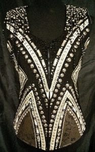
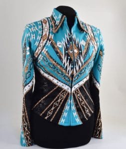
“Neutral tones are always ‘in,” and the reason the color of gray is so prevalent right now in the horse show industry is because it’s a neutral, just like black or white,” says Wendy Brown of Show Me Again. “You can never go wrong choosing a neutral, especially a base color like black.” (Photo © Silver Lining)
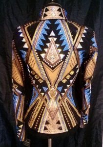
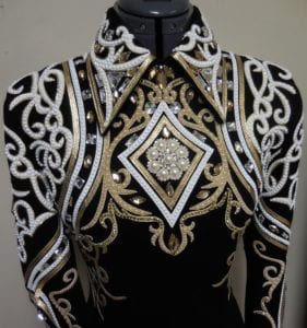 “I try to advise customers to take a bit more of a neutral approach,” explains Darlene Lowe of DarDar8 Designs. “I tend to use black and white as base colors for most outfits. It makes it so much easier to match hats, show pads and boots, but I also am a very practical person. Having a black based outfit is easier for resale later on.” (Photo © DarDar8 Designs)
Lindsay Klempel of Silver Lining Apparel says neutrals can be just as intriguing and eye-catching, “I don’t feel like there always has to be this bright color pop to be pretty. Some of the prettiest outfits, in my opinion, are neutral shades paired well together.”
Utilizing Color
 If you do opt for focusing on color, Babe Woods of Woods’ Western says there are a few considerations. “The horse color must be the main factor; you can choose to match or contrast the color with your horse, just not conflict with it. Quite a bit depends on the confidence and experience of the exhibitor whether they want to blend or stand out. Pretty much all of the greens and blues are quite neutral and shades of all the earthy colors work well with most.” (Photo © Woods’ Western)
“It is usually most pleasing to the eye to see complementary colors together,” adds Brown. “For our show world, that might mean 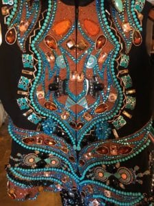 matching some copper or rust to a sorrel or chestnut horse, or gray to a gray, or black on a black horse, or using a color that’s next to it on a color wheel, like brown on a sorrel horse. Most exhibitors will try to pick a color that does complement a horse, or one that is neutral in order appeal to the eye.” (Photo © D Designs)
Using a small amount of color is a popular method to include the desired color without going head-to-toe. “Many times it is your accent colors that will tie the horse color back in,” advises Woods.
“If they want to use a bright color such as red, or royal blue, I usually advise that they keep the coordinating color to something like white or silver and to use a black or black base color,” says Lowe. “This gives a nice clean, bright appearance in the show ring.”

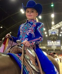
 Klempel says if you’re still not sure, pick what you feel best wearing. “As far as color, the advice I give to customers is to choose a color that both complements their horse and themselves, and most importantly choose a color they feel great in. At the end of the day, it’s hard to say, if choosing a complementing color matters a whole lot, but it helps create a pretty overall look.” (Photo © Silver Lining)
Also an advocate for the concept of wearing what feels best, Tammy Dyer of D Designs has this to say, “Some customers worry a lot about matching the color of their horse. Other customers go with the colors they like and make them feel good. I think it is really up to the client and what makes them feel the best. The better you feel, the better you show. Some colors definitely look better on some people than others. But again, it is how it makes that person feel that matters most.”
Test the Color
 Brown recommends comparing the garment or color swatch to the horse to determine compatibility. “We encourage our customers who visit our mobile unit to hold it up to the horse at the show, or take advantage of our trial period to see if it works in person.” (photo © Silver Lining)
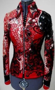
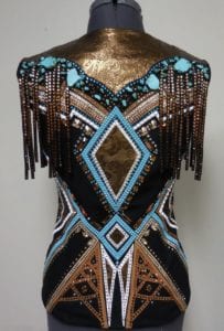
Lowe says that if you are ordering custom, you can experiment with colors in other ways. “Drape a shirt or blanket in a color you want to try across your horse’s back, then stand back and take a look at the effect. There are some great classics that always work with certain horse 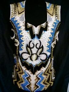 colors. For example, with a black horse, I love a jacket or vest that has a lot of white with some gold or silver. You don’t want to wear something that is too dark against a dark horse or you risk blending in too much.” (Photo @ Silver Lining)
Woods notes that checking the color from a distance is just as important. “Always keep in mind the distance that you are being judged. Make sure that the colors you are using show up the way you want them to. Standing in front of the mirror admiring a small amount of a certain color you used is going to look completely different across the pen.”
Body Type
 Color, they explain, can be used appropriately to enhance a rider’s body type, too.
“Different body types require different lines to help hide any imperfections, and we all have them. Various fabrics and colors can also help,” explains Dyer. (Photo © Silver Lining)
Klempel says that where the color is used can be the determining factor in the completed look on the rider. “As far as choosing a color for body type, it really depends on how the color is used and where the color pops on the garment.”
“You always want to enhance your good points and ‘work with’ the areas you may have issues. Proper design placement and color will help accomplish these things,” agrees Woods.
 Lowe elaborates on how color placement plays a key role: “If a client is petite, or short-waisted, it’s best to have vertical or monochromatic design work, and not a lot of color blocking, or horizontal lines. I like the bottom color of the vest or jacket to be the same color as the chaps. It’s fine if above the waist is a light color, but if the chaps are black, I prefer to see the bottom of the jacket or vest blending in, it makes a smooth line, and is more flattering to most women.” (Photo DarDar8 Designs)
“Creating that smooth line or silhouette,” Brown concurs, “is additionally possible when you wear the same base color from head to toe, especially if you’re going for neutrals like black and gray. It never goes out of style, and if you want a long, uninterrupted line, you’ve got it.”
Age Division
Since age is just a number, setting a strict standard for the appropriate colors hasn’t caught on.
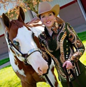
 Woods says, “There aren’t really set in stone ‘rules’ for age and division. Age is more of a mental perception I feel. You will hear someone at 45 who says they are too old to do whatever and then see an ‘older’ person who will tackle anything. So this 45 year old may show in a quite sedate outfit and feel comfortable and the ‘older’ person show up in just the opposite. Neither is wrong; that’s who they are!” (Photo © D Designs)
In general, most favor a more neutral or traditional look for mature riders, and brighter colors for the younger groups. But, says Lowe, there are exceptions to most fashion rules. “As with everything, an exhibitor should wear what makes them feel confident, so if you are unsure, get a second opinion from someone you trust.”
 “I like a clean conservative look for mature riders,” explains Dyer. “However, I love the colors for the youth. We like to put together unusual combinations for our youth. We can really have fun with bright colors and designs.” (photo © D Designs)
“I do agree age has some weight when choosing colors,” says Klempel. “I don’t like bright colored chaps on amateur or select riders, but I’m all for a good pop of color in a shirt in all age groups. As long as you are confident in the outfit you’re wearing and it makes you feel great, that’s what’s important.”
“Bottom line,” says Brown, “You have to feel comfortable in the color you’re wearing, so don’t over think it and go with your gut instinct – but be willing to try on colors you haven’t before (like something with a small amount of pink), and don’t be afraid to mix a color you truly love – one that maybe you shouldn’t wear head to toe with a neutral base so you have the best of both worlds.”